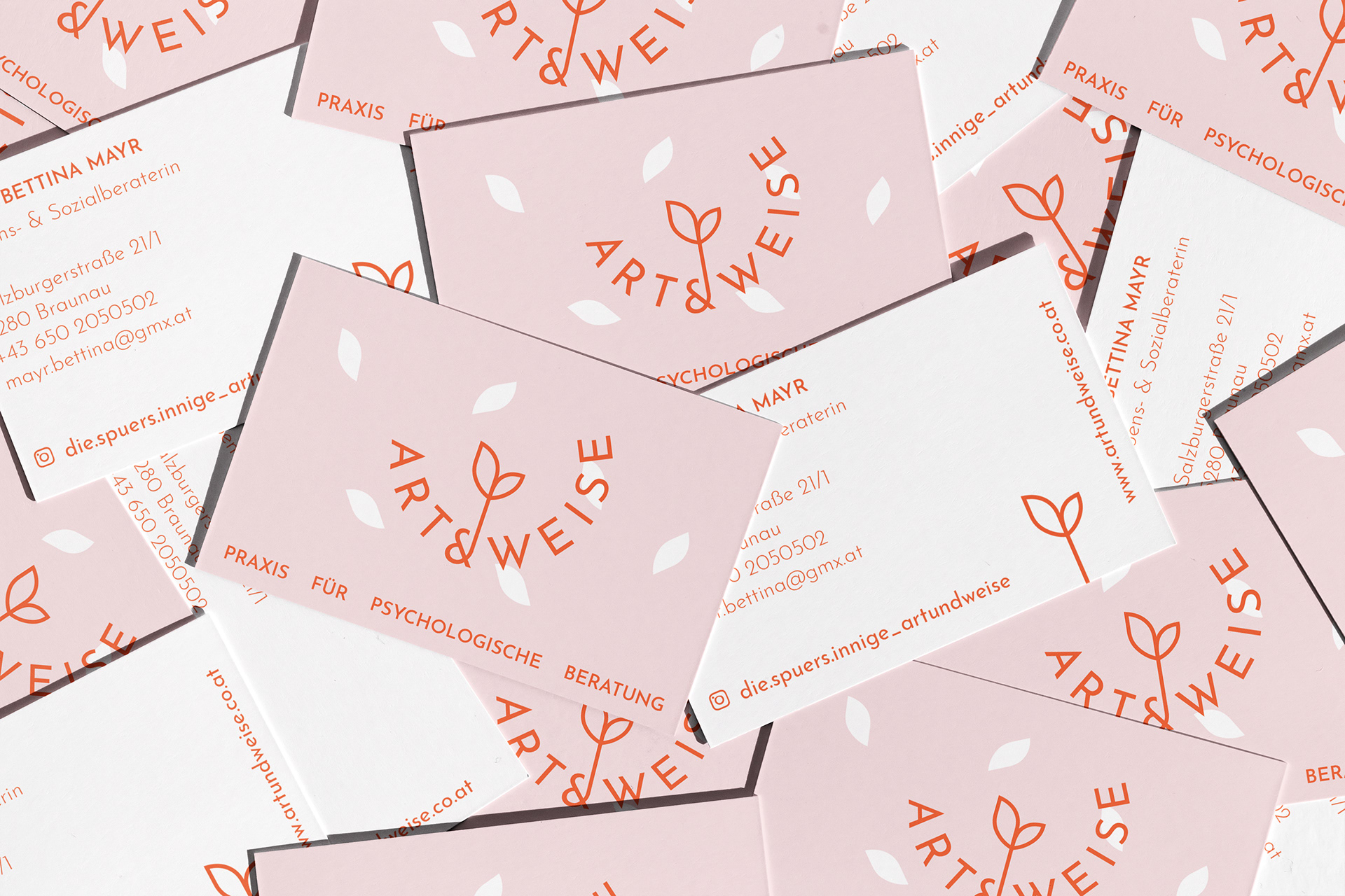


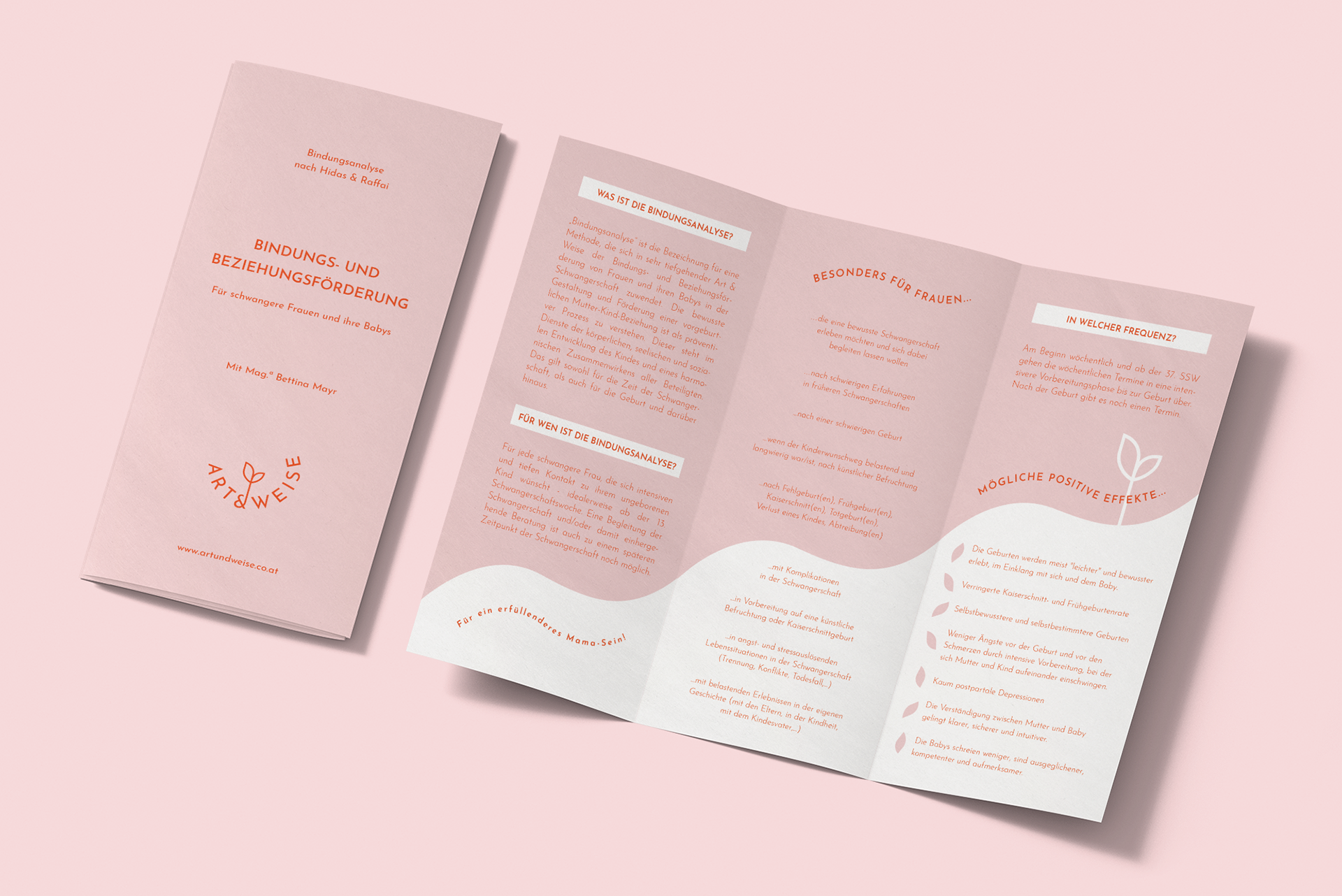

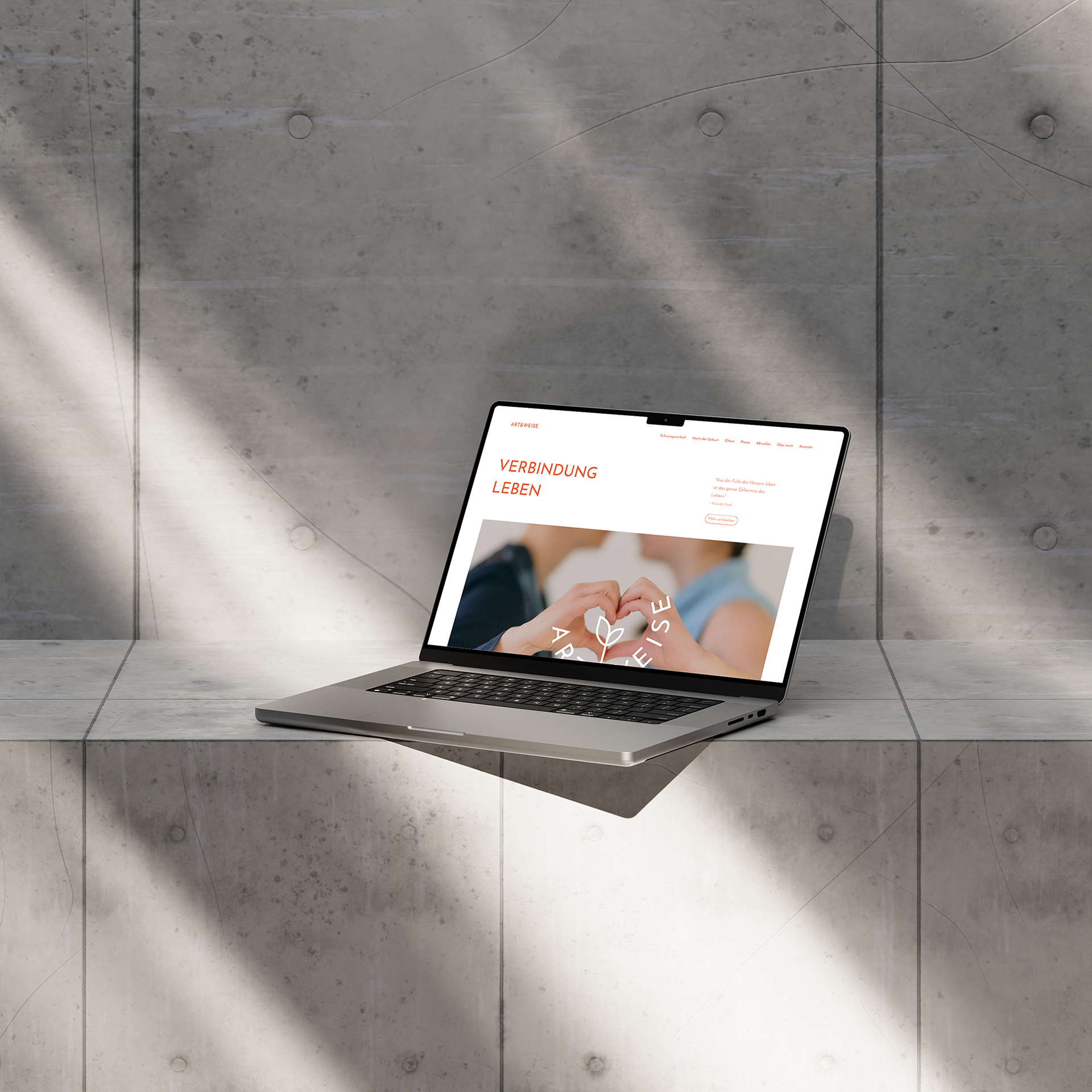
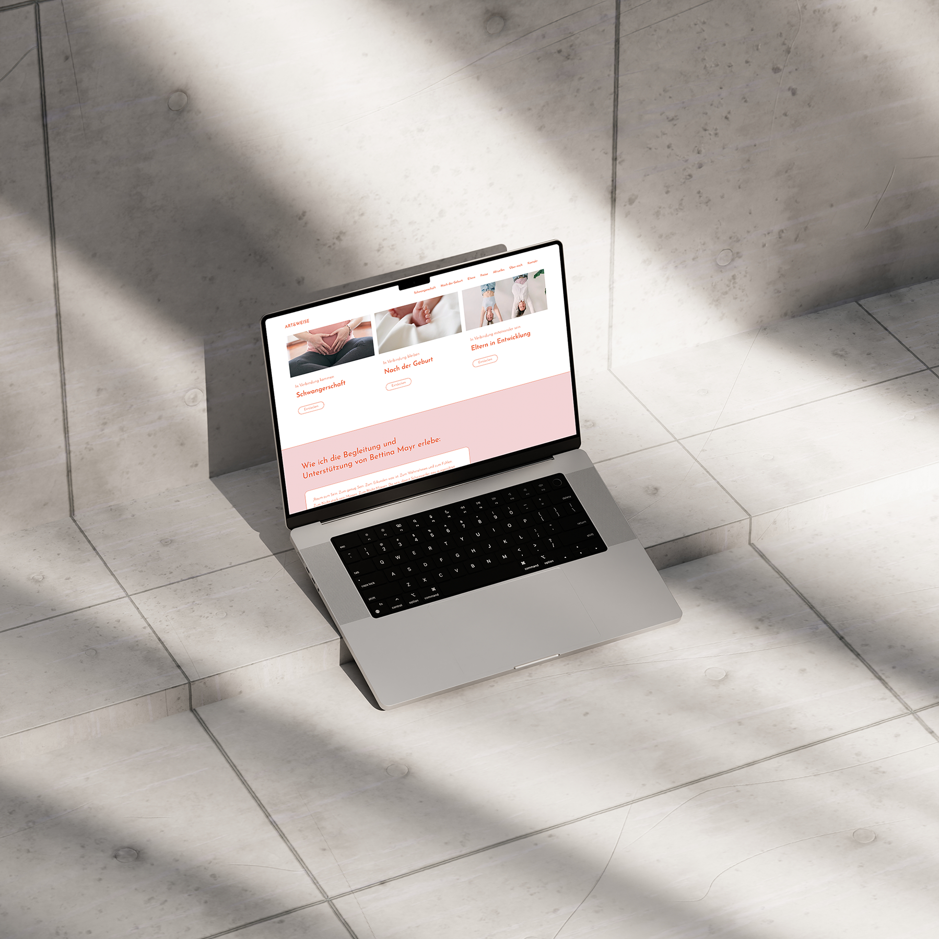
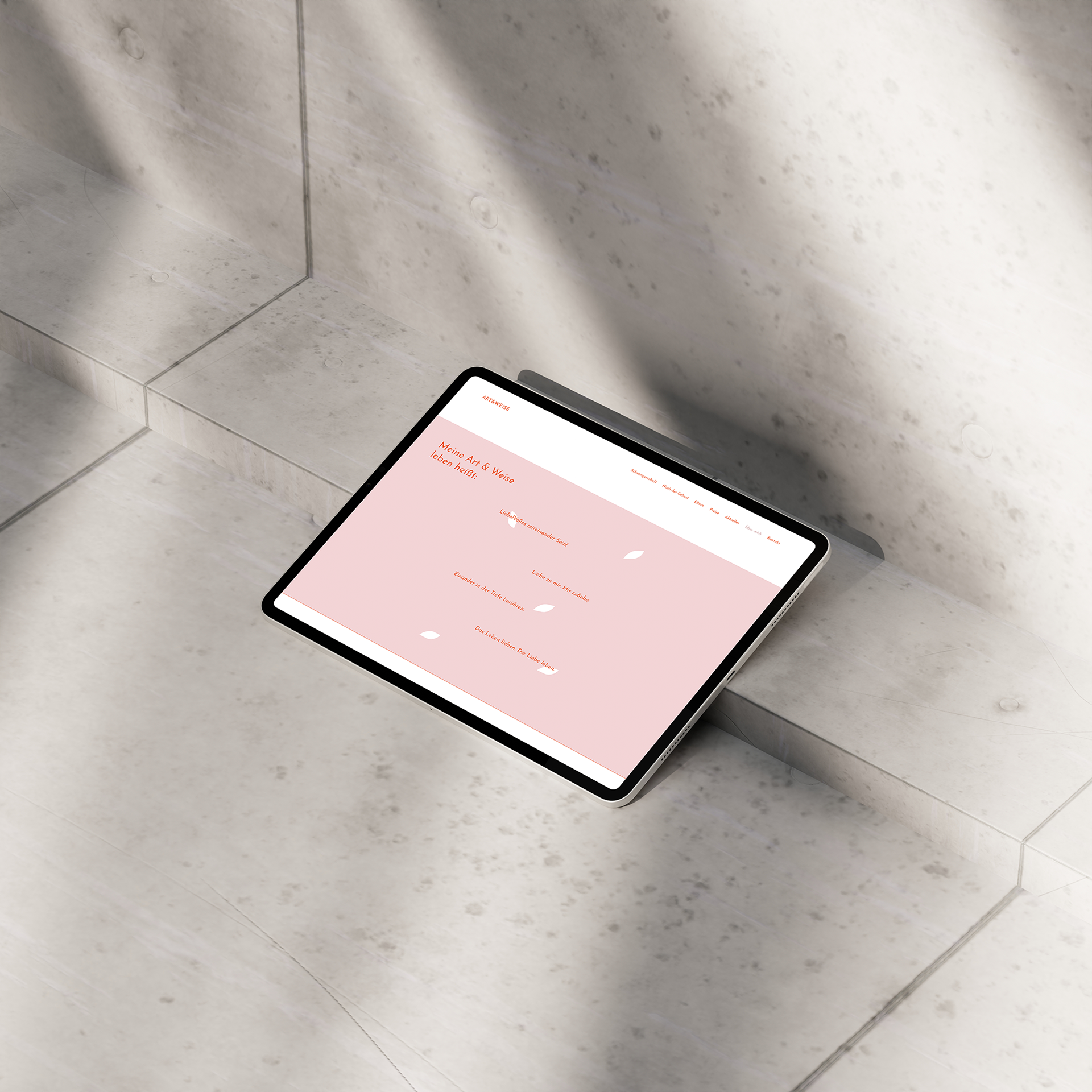
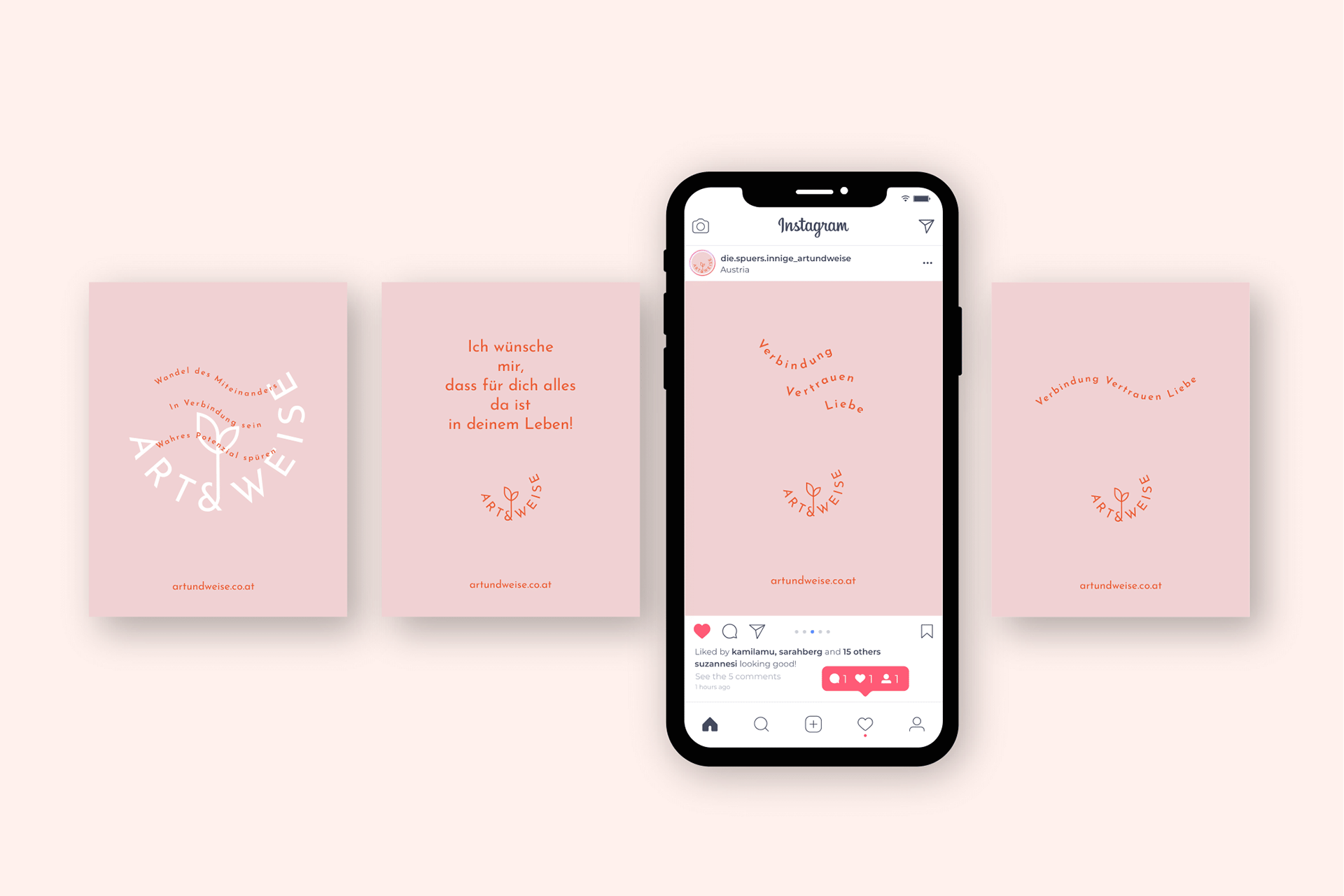

Art & Weise is a one-woman business with a focus on relationship building. My client is a life and social coach and is specialized in working with pregnant women and women with difficult birth experiences. My client‘s practice for psychological coaching is based on the values of connection, trust, and love. The key symbols for my client are roots (for being rooted), a heart (for love and warmth), and a circle (for being together and connected). Flowers and plants also play a role in the business idea as a symbol of awakening and growth. I considered the brand values in the design process and created a logo rooted at the bottom and open at the top. Moreover, the logo center shows a heart-shaped plant, growing out of a strong base. The visual identity of Art & Weise should appear delicate, but by no means fragile, and show strength. This demand is reflected in the combination of soft pink and strong red.